Author: Naomi Chung
Editor: Katie Kavanagh
Artist: Naomi Chung
Emotions are often associated with colour both in the media and in our daily lives. We often hear and use phrases such as “seeing red” for anger, “getting the blues” for melancholy, and for depressive feelings “everything seems grey.” These comparisons tend to be taken metaphorically, but what if the world does look greyer for those suffering from depression?
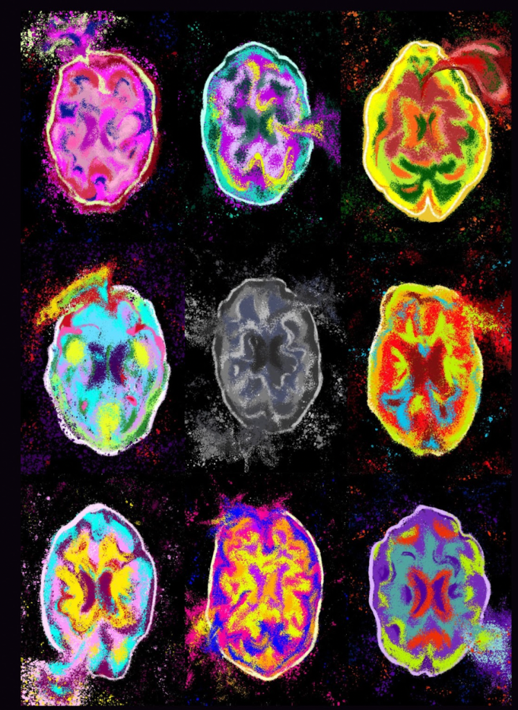
Depressive disorders come in many different forms, but the general diagnostic criteria includes low mood, loss of interest in pleasurable activities, disruptive patterns in eating and sleeping, etc., according to the International Classification of Diseases (v. 11) published by the World Health Organisation. However, despite frequent mention of altered visual perception by moderate to severe clinically depressed patients, there is very little focus on these symptoms. Depressive disorders affect the hippocampus in the brain, which neighbours the area of the brain corresponding to colour perception, including the V1 and V4 areas of the occipital cortex, the lingual gyrus, and the fusiform gyrus.
A study in 2021 has found that people with moderate to severe levels of depression find it harder to distinguish between similar colours than people without depression. This study was conducted using the Farnsworth-Munsell 100 Hue test to allow colours to be quantified, which is important due to the subjective element of the categorisation of colours. The results of this study correspond to research from the past decade, discovering that depressive patients see colours in lower luminance and lower contrast, meaning they see colours as less saturated and are therefore less able to see the difference between similar shades.
Interestingly, depression not only affects the perception of colours but also the interpretation of them. In Taiwan, a study was conducted on a group of design students, separated into ‘depressive tendency’ and ‘non-depressive tendency’ subgroups. These students were asked to associate 14 Munsell colours with words. There are no discrepancies in colour association between the two groups, apart from the colour dark grey. The non-depressive cohort associated it with words like “dirty” and “gloomy,” whereas the depressive tendency group used more negative words like “hopelessness,” “fear,” “depression,” etc. The students were then asked to paint their self-portraits with only these 14 colours. Considering the results of the previous half of the experiment, it is not surprising to find out that only individuals from the depressive tendency group used the colour dark grey.
Research into the visual symptoms of depressive disorders is still in the early stages, as there are a wide range of differing symptoms between individuals. The earlier we acknowledge the effects depression has on colour perception, the easier it is to provide treatment for those that experience such symptoms. This is especially helpful for patients that are young or non-verbal, as they can use other means of communication to express how they feel and what they may need. This research could potentially improve current treatment by incorporating art therapy into traditional treatments for depression. This alternative treatment can open up more opportunities for individuals to improve their depressive symptoms. Hopefully in the near future, our understanding of colour perception can be used to improve the lives of people who suffer from depression.
